Quantcast
Channel: by THERESE KNUTSEN
Viewing all 36 articles
Browse latest View live

SPRING IS IN THE... EGG!

$
0
0

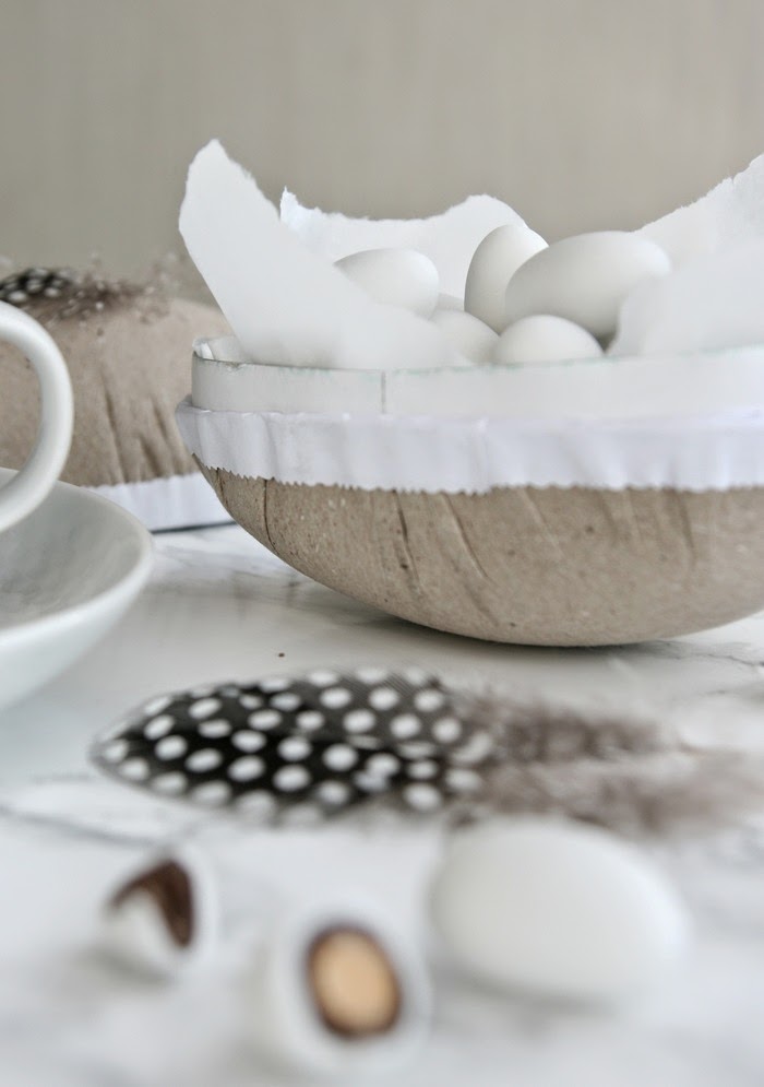
Det spirer og gror i påskeegget i år ;-) Friske grønne spirer i et pappegg er naturlig og dekorativ  påskepynt , samtidig som de smaker fortreffelig på brødskiven til morgenkaffen!


Dette er virkelig enkelt å få til. Det eneste som trengs er et egg i papp, litt bomull, og karsefrø eller andre spirende frø. Legg gjerne litt plastfolie i egget aller først, så et lag bomull. Strø over karsefrø,og vann ofte. Sørg for at frøene får masse dagslys. Innen få dager spirer det i egget :-) Supert å gjøre sammen med barna. 

PS! Har du  ikke tid til å vente på at frøene skal spire før du skal pynte bordet, så får du tak i ferdige spirer i velassorterte dagligvarebutikker. Dette ble redningen min i år ;)


Vår på bordet  

// Images: Therese Knutsen //

Svigermors hjemmelagde platebrød, smøreost og spirer...Mmmm!


Such an easy easter DIY, both decorative and tasy :-) All you need is a paper egg, some cotton, and a few cress seads. Follow the instructions above. Water daily, and you will have tasty sprouts on the breakfast table in only a few days :-) And if you do not have time to wait for the sprouts to grow, do like I did this year, buy the finished ones at the store  and put them in the egg to decorate your easter table ♥ 
Voila...spring is in the egg! ;)


Therese


I AM READY

$
0
0
- HAPPY EASTER -


Siste forberedelsene er unnagjort! Endelig er bilen pakket og vi er klar for den årlige hyttepåsken, sent men godt! 


På hytta er påskeeggene fargerike, med påskeharer og gule kyllinger på. Og oppi er det jo enda mer fargerikt. Fylt til randen med barnas favoritter :-)  Derfor har jeg "avreagert" litt nå før vi drar... med mitt naturlige gråpapirfargede pappegg, pyntet med en enkel  fjær fra en perlehøns, og fylt med en av mine favoritter. Hvite dragèrte mandler...lykke! :-)


Med litt hvitt bakepapir i egget og et fint bånd rundt, blir dette egget raskt en fin liten gave å gi bort om man skal på besøk nå i påsken. 

//Images: Therese Knutsen //


 GOD PÅSKE!
Nyt fridagene og hverandre.


Finally! Everything is packed, and we are ready for the annual  easter holiday in the mountains!  At the cabin everything is colorful at easter. Yellow candles, and our childrens handpainted eggs at the table. The large easter eggs have colorful pictures of yellow chickens, and cute easter bunnies. And the inside are even more colorful! Filled up with the childrens favorite sweets :-) 
So, before we leave I enjoy my neutral colored paper egg, decorated with a single feather from a guinea fowl.
 And inside...one of my favorite treats, chocolate covered almonds. Mmmm!

HAPPY EASTER EVERYONE!


Therese

SUMMER VIBES

$
0
0
IN THE BEDROOM
 
Jeg liker så godt de blåhvite stripene på sengetøyet om sommeren, men uten at det blir for maritimt i uttrykket. God stemning i bildet fra HM Home SS 2014
 
Sommerfølelsen kommer smygende nå som vi har hatt så mye deilig vær. Dager på Stokkøya med vakker solnedgang på strandbaren, en produktfotoshoot i fjæra forrige uke (bilder kommer på bloggen når de har vært på trykk i avisen), har virkelig gitt de rette vibbene :-) Sol, sjø, og svale tekstiler...  

Fantastisk blåhvitt sengetøy i lin fra Slettvoll. Perfekt!
 
 
Drømmer om dette sommerlige sovrommet!
 
 Via


Tenk å våkne i dette naustet en solskinnsdag, ta et morgenbad før frokost, eller ro en tur utpå med morgenkaffen...Idyll!


Sobert og svalt soverom der stripete tekstiler gir den rette stemningen. Lignende tekstiler finner du Her og Her
 Hva er sommerlig for deg i hjemmet?


Ha en fortreffelig helg alle sammen, forhåpentligvis med litt sol og sommervarme :-)


The sunny weather, a fantastic trip to Stokkøya, watching the sunset at the beach bar, and a summer product photoshoot by the boathouses last week, have given me some great summer vibes :-) I am so fond of blue and white stripes in the summer bedroom, without the typical maratime theme. A bit more serene and neutral. ;)
Do you get the summer vibes from these cool, calm and airy bedrooms?
Can you imagine.., waking up in a boathouse, swimming before breakfast, or having your morning coffee in a tiny wooden row boat straight out of bed...

Have a lovely weekend everyone, hopefully in warm and sunny weather :-)


Therese


PARTY TIME

$
0
0
 
Mai...en strålende festmåned!
 Lysere og varmere dager er jo en fest i seg selv, og naturen, et fyrverkeri av friske grønne knopper som brister. Kvitrende trekkfugler feirer at de er tilbake, og ikke minst grunnlovsfeiringen vår...
17 mai!
 
 
Jeg er veldig takknemlig og stolt over å bo i dette fantastiske landet , og stemningen er ekstra stor når det skal pyntes til 17 mai feiring i år. Grunnlovens 200 års jubileum må jo markeres :-)
 
 
De klare norske fargene, sammen med nyplukkede hvitveis fra skogen utenfor. Trenger ikke mer spør du meg. To hvitmalte grillpinner, litt hyssing og noen flagg, gir feststemning til desserten. Flaggbåndet under kuverten fant jeg hos  Kremmerhuset
 
 
 Helt gratis, ubetalelig vakre!
 
 
Ja, ja, dette byr jeg på i anledning jubileet ;-) Meg i mitt aller fineste plagg, sunnmørsbunaden som min mamma har brodert!♥ 
Og selvfølgelig tar jeg frem den nydelige sukkerskjeen vi fikk i bryllupsgave når bordet skal dekkes. Gullbladet ligner litt på bunadsølv ikke sant?
 
 
Hvitt, stilrent servise lar de norske fargene få all oppmerksomhet denne dagen. Serviset heter Saturn og er fra Porsgrund Porselen. Glass, Odysse fra Hadeland Glassverk
 
 
Håper dere har fått noen ideer til festborddekking nå i mai, og ta gjerne en titt hos NIB for masse flott festinspirasjon :-)
 
 
- Kom mai, du skjønne milde...-


Party month of the year here in Norway..May! The days are brighter and longer, the birds are singing again, and the trees are bursting with fresh green leaves :-) And the 17th!
  I love to set the table for the annual Constitution Day, 17th of May. Even more so this year,  when we are celelbrating the 200th anniversary of the Norwegian Constitution! So proud to be Norwegian, and to live in this wonderful country.
 White tableware, fresh Forest Anemones, and then some red, white and blue. Perfect!
And of course, I am wearing my most precious garment, my traditional Norwegian costume! Embroidered by my mum  

Party time!
 

Therese 


GOING GREEN

$
0
0
 
 // Image: Therese Knutsen //
 
Så ble det fredag igjen...♥
 Dagene raser avgårde, og jeg har dessverre ikke mulighet til å være her på bloggen så ofte som jeg ønsker! Kommer sterkere tilbake jeg lover! Uansett... håper dere fortsetter å titte innom, og fortell meg gjerne om det er noe dere ønsker mer av på bloggen :-) (Alle kan benytte kommentarfeltet nederst) I et heller hektisk renoveringskaos, har jeg ett mål denne helgen, å plante små erter i jorden slik vi gjorde i fjor. Ta en titt HER  Så nydelige på smak, og dekorative å se på. :)
 
 
Grønnfargen har krøpet under huden igjen, slik den pleier på våren. Bildet over minner meg på å handle inn epler, spinat og ingefær til helgen. Den beste GRØNNE juicen ever Ja, og coctailglass "må" man jo ha og servere den i ;) På handlelisten det også!
 
 
 Inspirasjon!
 
 
Gleder meg til de varme sommerkveldene ute med frodig grønt på bordet, og lys og lykter når det blir skymt på terrassen.
 
 // Images: Via //
 
 Grønt skal være med både ute og inne i år! Grønne vekster er tilbake for fullt i trendbildet. Fikentrær, bregner og oliventrær skal fylle både terrassen og stuen denne sesongen. Herlig!


Ha en strålende helg alle sammen!
 Jeg skal få lagt ut oppskriften på en kjempegod salat her på bloggen i morgen, nevnte den på Instagram denne uken! :)


Friday again So much to do, and not enough  hours in the day... I am so sorry that I don`t have enough time to blog right now! Anyway..:) The color green is always a favorite in the spring! Such a fresh and happy color, and I really love this seasons big trend, green plants! Both indoors and outdoors
 One thing on my to do list this weekend is to plant some peas, a great sucsess last year. Take a look HERE
Tasty, crispy green, and very decorative!
 
Have a wonderful weekend everybody!


Therese 


SUMMER SALAD

$
0
0
 
Selvfølgelig skal dere få oppskriften!!
Denne sommerlige salaten er på middagsbordet mange ganger hele sommerhalvåret her i huset, og det er absolutt ingenting i veien for å lage den resten av året heller :-)
Laget den en dag denne uken, og flere ønsket oppskrift, så her er den. Enjoy!
 
Gjør slik:
 
Start med å legge kyllingfiletene til marinering/glazing i en pose. I posen har du soyasaus, honning, og chiliflakes.
Lag dressingen og sett den kaldt (Se oppskrift under)
 Bland salatingrediensene i en bolle.
Jeg elsker avokado, så jeg la til det i salaten også.
Stek kyllingfiletene et par minutter på begge sider ved nokså høy temperatur, la de deretter bli gjennomstekt på lav varme.
Rist cashewnøttene i en tørr stekepanne til de er gyllne.
Server kyllingen i skiver, på en seng av salaten, og toppet med dressing og nøtter.
 
 
Nydelige smaker, og syltet ingefær setter virkelig prikken over i en her :)
 
 
Dressingen er superenkel, frisk og syrlig.
Riv eple på et rivjern, her kan du velge selv om du vil ha de grovt eller fint revet.
Bland sammen finhakket hvitløk, kesam og eple.
Smak til med karri, salt og pepper, og til slutt litt sitronsaft.
 
Denne må dere bare prøve altså! :-)
 
Håper helgen har vært super , og ønsker dere alle en fin ukestart!


I have to share this lovely salad recipe with all of you. My favorite, this time of year :-)
It is so fresh and crunchy,  and it tasts devine! 
 
 
Therese


TAILORED SOLUTIONS

$
0
0
 
Vi er i en oppussingsboble om dagen. Det skal velges gulv, kjøkken og takbelysning...fliser til badet, hvitevarer +++.
For ikke å snakke om alle de supersmarte, skreddersydde, spesialløsningene som skal lages, ha, ha.;-)  Hvis vi bare vil, så får vi det nok til, det må være mottoet her nå. Som glassveggene vi ønsker i stuen for eksempel, den er ikke hyllevare på Maxbo akkurat ;)
Jo da, jeg har funnet firmaet som har laget dørene på bildet over, men de holder til i Amsterdam...ikke bare enkelt altså!
Firma heter forresten Exclusive steel, om det er flere enn jeg som liker slike dører/vegger :-)
 
 
 Akkurat sånn vil jeg at veggen vår skal se ut!
 
 
Dette blir veggen som skal dele stue og "tv-stue" i huset vårt. En slik vegg av glass deler rommet i soner uten at romfølelsen blir borte. Brukes det lydisolerende glass, blir ikke støyen fra tv-en et problem i resten av stuen, og så er jo veggen veldig dekorativ synes jeg. :-)
 
 
Slik blir det fra tv siden, og her er vi nå i gang med å fore ut veggen slik at tv-en kan felles inn sammen med alle ledninger, bokser og duppeditter ;) De feltene som ser litt gjennomsiktige ut på tegningen over, dekkes med høytalerstoff eller sort glass, slik at boksene er ute av syne, men likevel fungerer når man retter fjernstyringen mot.
 
 
Jeg er ingen tilhenger av at tv-en blir et fokuspunkt i rommet. Felles den inn i veggen, samt at veggen males sort, blir den heldigvis nesten usynlig ;)
 
 
Tv veggen under bygging, jeg tror det blir bra!
 
// Images: Via and drawings: Therese Knutsen //
 
Tv-n monterer vi på en arm slik at den er fleksibel, og kan trekkes frem når vi trenger å komme til ledningene og stikkontaktene bak. Skuffemodulene under males i samme matte farge som veggen, og gir rikelig oppbevaring. Med push åpnere slipper vi håndtak, og får dermed et rent uttrykk på hele møbelet.(Ferdig resultat kommer senere.)


 Håper dere synes det er greit med litt oppussingsoppdatering her på bloggen, så kommer det mer fra huset etter hvert. ( Det tar bare litt laaaang tid, når man skal gjøre mye selv etter arbeidstid;)  )


Nå er bunadskjortene strøket, sølvet pusset, og hele familien gleder seg veldig til 17-mai feiring i morgen! Nyt fredagen, og kos dere på nasjonaldagen! HURRA!


We are getting there ever so slowly in our new home, renovating, and working on how to get everything the way we want it. Like some practical tailored solutions to fit our needs, and to give the rooms the right look. Like a glass wall, deviding the livingroom into different zones, and a tailor made tv wall, where the Tv is buildt in, and everything is hidden. These are some of the projects we are working on right now:-) More from the house later :-)
 
Getting ready for 17th og May right now, preparing the costumes and baking a cake during my lunch break :-) Now back to work, and soon...
 
T H A T    L O V E L Y   F R I D A Y   F E E L I N G!


Therese

SUMMERTIME

$
0
0
 
Sommeren er her nå ikke sant? ;-) I dag er i hvert fall bildene jeg stylet og fotograferte på trykk, med tittelen "Sommerstemning" Jeg løp rundt i butikkene på et kjøpesenteret her i Ålesund, lånte med meg sommerlige interiørprodukter og slepte alt med meg ned til naustene i fjæra for å lage sommer i april ;)
Tips! Bruk speil til å reflektere dagslys og utsikt, både inne og ute i hagen!


 Min lille sommerartikkel i avisen til Ålesund Storsenter i dag :)


Og sommer var det faktisk den dagen i fjæra, i april. Jeg fotograferte iført singlet, drakk iskaffe , spiste jordbær, og kjente på den deilige sjøluften. En deilig dag på jobb!!
 

Dette må dere bare teste!  Iskaffen smaker så mye bedre når den ikke blir utvannet. Liker du sterk kaffesmak, bruker du frosset espresso i glasset, vil du ha den mildere fryser du vanlig kaffe og bruker det. Mmmm!


 Olivenbrød med timian, dyppet i trøffelolje smaker sommerferie i Italia...,
og rutete kjøkkenhåndklær blir så fine servietter på sommerbordet, enig? :)
 
 
Nydeligste vannglassene fra Wik og Walsøe


 // Styling and photo:: Therese Knutsen //
 
Picnic i fjæra med iskald lemonade og god mat, det er..
 
- S O M M E R -


Summertime is here, right? :-)
Well, today my article showing some summerpictures I styled and photografed a warm sunny day in April are puplished, in a local newspaper here in Ålesund. The photoshoot really gave me that warm summerfeeling! Follow the links above if you are interested in any of the products, and make sure you try freezing espresso or coffee in ice cube trays to make a delicious iced coffee this summer. Using frozen coffee, prevents the drink from getting watered down when the ice cubes melt!


Therese


BREATHTAKING DESIGN

$
0
0
 
IN GREECE
 
 
Ja, her snakker vi infinity pool...
Kois Associated Architects har designet dette fantastiske huset som ligger på øya Tinos i Hellas.
Huset er bygget av stein fra området, og er plassert slik i terrenget at det  nærmest er usynlig.
 

 Sett fra adkomsten til huset, som er på et høyere nivå enn huset, ser man kun bassenget som "forsvinner" ut i havet. Perfeksjon!!


 Under bassenget kan man sitte i skyggen å nyte utsikten.
 
 
Les mer om prosjektet HER


I en travel hverdag, er det lov til å drømme seg litt bort i lunsjen ;)


Det er jo til å miste pusten av ikke sant!?
 
 
Håper dere nyter fine sommerdager!
 
Jeg sitter her på kontoret og gleder meg til ferie om kun få uker, men først ...jobbe, jobbe! :-)
En Oslotur på programmet igjen denne uken, og det er jo alltid bra;)
Er tilbake på bloggen så fort jeg får tid!
 
Therese


MY DARK SIDE

$
0
0
 
 Til tross for at det flommer inn med dagslys og solskinn nå på sommeren, og at jeg elsker det lyse, hvite og lette, så blir jeg også veldig inspirert av de dype palettene. Mørke farger, ulike overflater, rene linjer, og bevisst bruk av kontraster skaper et spennende uttrykk synes jeg. :-) 
Dette har nå blitt til en ekstra instagram konto @eyeondesign4u
 
 
Her setter jeg sammen bilder som jeg har samlet på min Pinterest kontoHER 
Interiør, arkitektur, mønstre, farger, detaljer og objekter i mørke nyanser plukkes ut fra mappene mine og gir denne instagramkontoen et eget uttrykk.  En motvekt til de mange hvite, lyse og lette inspirasjonskontoene på Instagram :)
 
Hva synes dere? Liker dere de mørke nyansene?


Bildene er i god Eye on details ånd, en god blanding av ulike elementer som trigger kreativiteten og gir inspirasjon. :) Alt fra fuglefjær, interiørløsninger, tekstiler, ulike overflater...., men i motsetning til instagram @eyeondetails, hvor de aller fleste bildene er tatt av meg med min telefon, er dette altså andres bilder, satt sammen med en "mørk" tråd ;)
 Min mørke side ;-)
 
 
 Har jeg opplysninger om produkter, arkitekter, designere, nyttige linker eller lignende, skriver jeg dette i teksten til bildet, slik at dere kan finne ut mer hvis det er av interesse.
Dette er noe jeg selv setter stor pris på når jeg ser noe jeg liker på nettet. :-)
 
//Images: Therese Knutsen //
  
På min Pinterest har jeg til nå opprettet 67 ulike mapper som inneholder over 1500 bilder i alle farger, stiler og nyanser, bilder som inspirerer meg på en eller annen måte. Ta en titt da vel :-) Kanskje dere også får lyst til å samle ideer og inspirasjon på en egen konto :) (hvis dere ikke allerede er hektet da, slik som jeg;)


Ha en fortsatt inspirerende helg alle sammen!


I am hooked!! Hooked on inspiration! :-) Pinterest, and Istagram... I use both these online tools to collect and share ideas and inspiring images. A few days ago I opened one more Instagram account @eyeondesign4u. This instagram contains inspiring dark colored pictures collected  online to my Pinterest account. This is different from my account, @eyeondetails. where all the images are  taken by me, and the theme and colors are random. 
This new feed is all about my dark side. ;)
 I love the crisp white light, and the bright sunny days in the summertime, but I am also very fond of dark hues, contrasts, and a deep, sophisticated color scheme. Selected images from the 67 different folders, and over 1500 Pictures saved on my Pinterest are put togheter to create this feed.
Quite the opposite of the many light, airy and white Instagram feeds out there.
 So...do you like dark hues and designs?
 
Well, anyway. Try it! Start collecting and sharing inspiration and ideas online1 ;) So much fun!
 
 
Enjoy the rest of the weekend everybody!
 
 
Therese

AUTUMN HUES

$
0
0
- GOLD AND BLUES -


 Oh hello everyone :-)
I am still around, and I have really missed the blog this summer. Vacation, loads of work, and our renovation project, are all reasons why the blog has been so quiet for some time.
 
I am so sorry!, but I am looking forward to sharing ideas, inspiration and interior design with you more frequently now ;-)  
I hope that all of you had a wonderful summer, and that you are just as happy as I am about the changing season, the new color schemes, and all the exiting autumn  news popping up everywhere!
Love it!
 
 
Royal Copehagen just launched their new deep blue, and black porcelain tableware. So beautiful, dark, and with a matte and silky surface. Take a look HERE 
 
 
  Today I really just want to show you a moodboard, an autumn forecast maybe. Picking up the colors I have seen most of both on the catwalk, and in the great world of interior design  right now. A lot of dark blues, soft warm tones and the trending touch of golden metal.
 
 
A favorite fashion designer, Elie Saab`s collection this fall. Shades of blue ;-)
 
 
The golden hues creates a warm balance combined with colder blues, and mixed with  neutral black and white, you get an interesting and sophisticated look in your home this fall,


 HM home collection also include a lot of blue color this season. Deep night blue bed linnen is a winner I think :) Check out their new products HERE
 
 Moodboards: Therese Knutsen/ Images: Via
 
Well...bring it on!!
 After a long,  sunny and warm summer outdoors, I am so ready for the rainy days, the falling leaves, lots of candle lights, and more time to be creative inside the house again, are you? :-D
 
 
I see that so many of you have been stopping by during the summer, and it makes me so happy! Welcome!, and feel free to leave a comment, ask questions, or just say hello in the comment field below. 
 
 
Have yourself a terrific tuesday everyone!


Therese


EYE ON DETAILS

$
0
0
- CONCRETE LACE -
BY DOREEN WESTPHAL
 
 
 Concrete, a material usually associated with heavy machinery massive structures and construction work, but not in the hands of Doreen Westphal Her beautiful, light and airy concrete lace is quite the opposite! Detailed, sheer lace patterns hanging in steel cables.
 
 
Her concrete "curtain" is the perfect decoration and room divider in both public and private spaces, a fabulous interior and exterior wallcovering, and also a great garden feature don`t you agree? :-D
 
 
The lace can be costumized and made in different patterns and sizes!
 
 Ohh, I would love to use this concrete lace in an urban garden project, streaming the sunlight, and casting beautiful shadows.


PS! More talented designers and artists with a sharp eye on those important details? ;) Check out the catagory box on the left. Click: "Eye on details"!


Therese


A TOUCH OF GLAM

$
0
0
 10, 11, 12, 13, 14,14, 1415, 15
 
Today it is all about glam and rock and roll everybody! Perfect start to a Thursday? :-D
Last week I wrapped up a project for a client so enthusiastic, positive, glam, and rock and roll, that you just have to smile and be happy around her :-)
So, her brand new house had to reflect her sparkling personality, right? :-)
 
 
After showing some of these pictures on my instagramlast week, I have got a lot of questions about the products used in this project. That is why I placed numbers under my moodboards today :). Click, and you will find information about the products. Random order, but helpful I hope!
  
1, 2, 3, 4,


The super cool art is painted by Espen Eiborg. Covered in gold leaf, it was just perfect in this house!


Some fresh green and white flowers puts the final touch to this glam livingroom before the housewarming party last weekend. I used only green and white flowers, to keep it simple and fresh. A lot of colorful flowers would have been too much here I think, agree? :)


5, 6, 7, 8, 9,

The fireplace is also my design. By keeping the fire wood niche and the TV in line with the fireplace insert, the result is a clean lined and contemporary look.

 // Images and collages: Therese Knutsen //

A mix of dark grey and white walls gives the room character, and enhances the golden details so well.

I hope this little peek at one of my projects inspired you this morning, and why don`t you try to put a bit of sparkle in to your home as well ;-D


Have a nice day!


Therese


BLUSHING AUTUMN

$
0
0
 
 The last few weeks, I have been looking at what`s trending this fall, and I found a lot of make up vibes ;-)
 
 
 Jotun just launched three new color palettes, Everyday Balance (green hues), Everyday Simplicity (black/whites) , and Everyday Beauty...sheer skin tones and subdued reds, named Warm blush and Whispering red. The inspiring color chart, Jotun LADY Balance will be in store during week 37.
 
 Jotun Balance 2859 Whispering red
 
 
All these soft, balanced colors look like their taken right out of a make up kit, right? :) 
Perfect harmony! 
 
Neutral, grey,  matte,"Pigment" wallpaper from Borås Tapeter
 
 The sheer Nudes and soft Corals are just stunning when mixed with neutral grey walls, and crisp white details.
 

 Jotuns palette Everyday Blance , front wall: Jotun LADY Balance 7555 Soft Mint. Right wall: Jotun LADY Balance 7163 Minty Breeze.
 
Minty greens... perfectly calm and peaceful on their own, and also a perfect match when combined with the blushing red trend  this fall.
 
 
 One more trend inspired moodboard I made. Top images Via Down left, one more Jotun LADY Balance color , Everyday Beauty: 2024 Senses. And far right, the beautiful New Norm Storage jars
 

 Jotun LADY Balance, Everyday Beauty, 2856 Warm blush 
 
//Collages by Therese Knutsen //
 
Late night trend post! Inspired?? I am! :-D


Therese


SLETTVOLL NEWS...

$
0
0
..SIMPLY FABULOUS!!
 
 
Slettvoll always hit me with huge amounts of inspiration!
This local furniture company, nails it everytime :-) Headquarters placed here in my hometown Ålesund, and the family owned factory located just outside the city for over 50 years!
Next week they launch their new fall catalog, and by looking at these pictures, I know it is going to be yet another  sucsess!

Patriot, and huge fan...OH YES :-)


Nothing is left to chance! 
Slettvolls photos, styling, and atmosphere are always perfect, and the location used to present their furnitures, always breathtaking! I could actually just move right into this house tomorrow! ;)

 
A  muted, neutral color scheme, with a touch og mustard yellow accents. A balanced and cozy livingroom dressed to meat the fall and winter months, don`t you think?
 
 
Even bright white furniture gets the warm autumn feel, by adding some details. A darker rug, some soft textiles, plenty of nice t-light holders, and a hint of golden metals. Great combo!
 
 
 Tips! Recreate this stylish theme in your home, done in a weekend!
Try painting the walls in a super matte, dark and luscious color.
1.Dempet Sort and 3.Amsterdam, are both neutral, rich and beautiful wall colors. And why not cover a wall in stone to get the right look. The thin 2.slate panels above, are so easy to put up!!
 
 
 When decorating your home, always remember to include pesonal items in the room, like Slettvoll has done in this diningroom. The huge shelves are the perfect place for family photos, vases, books, or other favorite things. Create  your own style, give each room the important personality of a home.
 Get inspired, but don`t blue print a catalog styling!  ;-)


 Clear, glas vases and Autumn colored flowers brings a vibrant freshnes to the calm and muted rooms, don`t you agree?
An easy and affordable way to create that wow factor!
 
Tips! Bye a cheap, mixed bouquet of flowers you like, split it up and put them in different size vases around the house instead of all the flowers in one :-) The shorter you cut them, the longer they last!
 

Loving this dark bedroom, and the soft bed linnen! And on the ottaman in front you can se a hint of yet another beautiful accent color this fall at Slettvoll;) Take a look HERE


 Nice soft rug, a big fireplace, and clean lined furniture....ready for Autumn/Winter 2014 from Slettvoll :)
 
 
It is all in the details... a close up from the new catalog launched next week. Golden metal, dark, smokey glas and warm orange feathers.


I T  I S  F R I D A Y..,
Y E S!!
 
Have a fabulous weekend everyone!


Therese 


BE BOLD, BE DIFFERENT

$
0
0
 
BLACK BRICK - WARM WOOD
 
 
Why not be a little creative when choosing materials and colors for the house! Not everyone needs to have a bright white facade and picket fences, right?
Some people are actually brave enough to paint their massive brick walls completely black! Yeah!! :-)) Just take a look at this great home, designed by Canadian architect Alain Carle. 
 
 
 Carle highlighted the entrance, the Windows, and all the terraces by adding warm cedar wood panneling.
 
 
Black brick, and warm wood works so well togheter!
The color and material mix enhances the building`s different sightlines and angles, giving it a clean and contemporary look, without leaving a dark and cold impression.
This is just the type of facade I am drawing for our dated, old house, to make it look modern and fresh! (a project  not even concidered this year ;)  )


Would love to see some furniture and lights in the windows though... :)


 Most people today do not want paneled ceilings inside their house! ( the agded pine wood often used in Norway, lookes a bit dark an dated) White painted plaster is the most popular solution (me included)
 But this home, is a perfect example to the contrary. The continuance of the outdoor paneling inside, is so nice!!
There are still several large, white elements in the house...the staircase, the kitchen units, the fireplace, all of them making the rooms look bright and spaceous! And of course there is the quality of the cedar wood as well, making it look so great:-)
 
 
The contrasts play very well togheter here. Light, dark, cold and warm. The trick is to get the right balance!
 

// Images: Via //
 

The warm wood in the ceiling really lifts this house I think, and tells me to be even bolder and more creative, when choosing materials for my own, and for my client`s design projects in the future!
 
Well.. one of my clients just ended up loving her totally dark bedroom, both ceiling and walls painted almost black, and another one has the whole ceiling covered in umbrellas.
  So.., a bit out of the box I guess ;-)
 
 
- Be bold, be different! -


Enjoy the rest of this weekend!
I am making pistachio/cinamon buns, and painting windows today (white...sorry ;) )


Therese

TUESDAY TIP...

$
0
0
 ...GARDEN PLANNING
 
August/September is actually the perfect time for some garden planning! :-)
If you want to improve, change, or maybe create a new outdoor area, start preparing now!. Be creative! Use the different levels in your garden to make planters,sitting areas, practical and estetic stairs and paths. Make sure you get shelter from the road. Use fences and hedges to create a private outdoor living space.
 
I help a lot of my clients with their gardens in the fall.
Togheter we come up with an overall layout, that best suits their wants and needs.
When the plan is ready, there are so much they can get done before the  winter arrives.
For example, in August/September, your garden is still green and blooming, and you can easily spot which plants to keep, to move, or maybe even remove all togheter. It is so much easier to remove unwanted plants and trees at the end of the season, when they are fading and withering away anyway.


Building terraces, moulding walls, stairs and planters...all perfect jobs to do in the fall, when you don`t spend that much time in the garden anyway:-)
By getting ahed with the build now, there will be less time wasted in the spring, when you really just want to enjoy the planting and the finishing touches, spending time and relaxing in your new outdoor living space :-)
 
Above, some drawings of a garden plan I suggested to a client who were starting from scratch. A lot of moulded concrete  planters, stairs and features. Would be great to get the heavy work done before winter right? ;-)

This is a project I am working on right now. I am helping my Clients find the final solutions to their already well established and almost finished outdoor area.
 
 
 Some nice curvy concrete planters, a large sitting area on top of the stone wall, an even  more spacious terrace on ground level, and some new functional stairs from the top to the bottom level.


 // Design, drawings and images: Therese Knutsen // 
 
My Clients often get a list of the plants I have chosen for their garden, wich makes it easy to start the planting in the spring. My advise is to get as much information as possible about the plants and flowers you want in your garden. Find out if they want sunlight or shade, how big they get, and what kind of soil they need to thrive. Plan your planting as well as your layout, and you will get a thriving green oasis, to relax in all summer.


I hope this gave you some ideas and inspiration to stay on a bit outside this fall, enjoying the colorful changes in the garden, and maybe make some exiting plans for next spring! :-)


Therese 


DESIGN HOTEL

$
0
0
THE WATERHOUSE
 
 
Some late night travel tip tonight :-)
I really love when industrial buildings are renovated and used for a totally different purpose, without loosing it`s identity.
A Perfect example, is the three -story Japanese Army headquarters building from the 1930`s, located on the South Bund District in Shanghai. The worn down building has been carefully renovated into a 19-room boutique hotel. So cool!!


The courtyard located whithin the waterhouse, has a clean white and minimal look, contrasted by weathered wood shutters on the windows, and a new addition covered in Cor-Ten  steel, to reflect the industrial past of the area around the hotel.
 
 
Inside the boutique hotel, the atmosphere is crisp, clean, and factory-like. Elements like the white, romantic chandelier creates interest and caracter to the rooms.


Love the weathered concrete wall!!
 
 
The two restaurants and the guest rooms are furnished Scandinavian style, by Danish designers like Arne Jacobsen, Finn Juhl, and Hans Wegner.


Room With a viewe! :-)


The Cor-Ten steel entrance connects the old and the new part of the hotel togheter.


And on top of the new built part of the hotel, you can enjoy a coctail, looking out on the Pudong ( the Shanghai equivalent of Wall Street) skyline.
 
Have a Nice evening, I`ll be back soon ;-D


Therese


CUSTOMIZE YOUR IKEA FURNITURE

$
0
0
 
SUPERFRONT IN NORWAY
 
 
September last year, I wrote a blogpost about how to Pimp Your Ikea, and I gave you some tips on how to personalise Ikea Furniture. Well, today I have even better news on the matter...Superfront opened their first showroom located outside of Sweden this morning, here in Norway! :-)

 
Their Collection includes 8 different patterned fronts, in 13 different colors. 8 different type of legs, and 7 different handles, in wood, brass, copper, marble and leather.


When using Superfronts patterned fronts, the ordinary Ikea kitchen will get a unique and personal style!


 New legs really changes the look on a furniture, right?
 
 
You can even customize the top and sides of your Ikea furniture. Choose from Carrara marble, limestone, or any of the 13 front colors. :)


If you are in Oslo, make sure to stop by Superfront`s new showroom in Akersgata 16! Customize, and create your own unique and exclusive look whitout spending a lot of money :-) 
 
 
HAPPY WEEKEND EVERYONE!
 
Therese

MASCULINE MONDAY

$
0
0
 
 
When fall arrives, the masculine colors, textiles and fashion trends always inspire me a bit extra! :-)
 
 
This clean lined interior has a masculine, yet calm and cozy feel, created  by matte and muted wallcolors, soft mustard yellow textiles and a thick wool carpet on the floor. The picture is from Jotun Lady`s new color chart "Everyday Simplisity", and the styling is done by the always inspiring duo Kråkvik & D`Orazio. Needless to say at this time, I    the industrial glas doors ! ;-))
 
 
The colors above are all from Jotun Lady`s "Everyday Simplisity". Great basic colors for your home this fall. Be creative, and make it more colorful and personal, by adding colors like mustard yellow, strong blues, or maybe a fresh rasberry red.


I find the masculine check and stripe psatterns looking balanced and sophisticated. Do you think it is to strict or boring?
 
//  All moodboards made by: Therese Knutsen, Images: Via  //
 
Leather is another material that I think fits this style. Leather furniture, headboards, handles, and even some nice, worn boots fits in here:)


 Via
 
Even if everything in this room is dark colored, it doesn`t feel unpleasant or boring at all! This diningroom has caracter and it looks cozy and inviting, right?
The Picture is from Slettvoll`s wonderful product catalog.


Hope your week has started out wonderful!
 
  I will be back tomorrow, with pictures of a stylish, and very masculine apartment in Berlin.
 Stay tuned!


Therese


Viewing all 36 articles
Browse latest View live